Créa
Brand identity design for a company dedicated to enhancing team dynamics through creative and engaging experiences.
Project Overview
While designing for Créa, I was fortunate to have the creative freedom to explore and develop the brand identity with minimal interference, which allowed me to truly align the design with the founder’s vision and values. The goal was to create a brand identity that not only resonated with the client but also captured the essence of their mission. I'm proud of the outcome, as it successfully reflects their vision and has been warmly received by the client.
About the Client
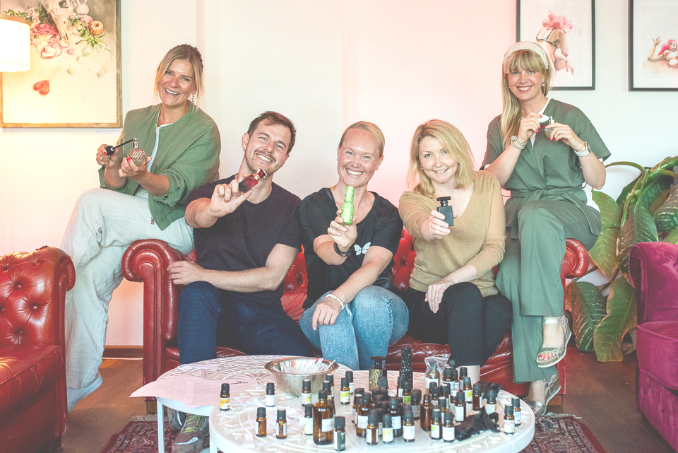
My client is a startup offering tailored workshops for teams to unlock creativity, foster new and existing connections, learn new skills, and have fun. With a diverse team of experienced coaches, they create customized experiences to meet the specific needs of each client.
Brand Identity Development
COLORS
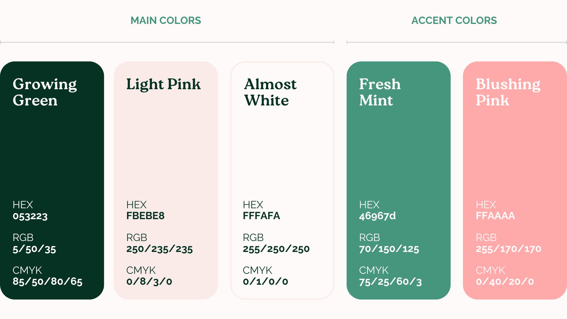
For the color palette, my client had a clear vision: they wanted something fresh and natural, with contrasting deep blues or greens and vibrant pinks, yellows, or oranges. Inspired by an extensive Pinterest board they curated, I developed five distinct color palettes, each with five colors. The client loved the options, making it a tough choice, but they ultimately selected a palette featuring greens and pinks. This included 'Growing Green,' 'Light Pink,' 'Almost White,' 'Fresh Mint,' and 'Blushing Pink'—three main colors and two accents. I think this selection beautifully reflects the brand’s values of growth and innovation.
FONTS
The typography selection was straightforward. I sought an elegant, natural, and slightly playful style, which led me to choose 'Roca Two.' Its bold weight serves as the main font, with thin as an alternative. For longer texts, I selected 'Raleway' for its elegance and readability. I feel that together, these fonts create a visually appealing combination.
LOGO
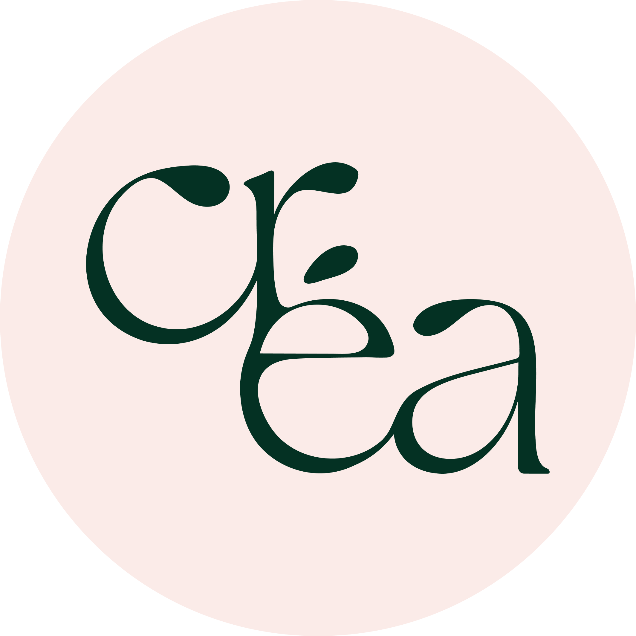
For the logo, I began by experimenting with the 'Créa' name in Illustrator, looking for a design that felt natural and elegant. I noticed the accent on the 'é' started resembling a seed, which inspired a theme of growth. I crafted the brand name to appear carved and rounded, with varying letter widths adding elegance. I decided to incorporate a sprouting plant next to the 'Créa' name, shifting away from typical symbols like microphones or lightbulbs. I believe this natural growth theme adds a unique element to the brand identity.
I also designed an alternative logo for use in areas like social media profile pictures. This compact version features the title on two rows, creating a cascading effect. It's ideal for spaces where a fully horizontal logo isn't optimal and readability isn't the primary concern.
GRAPHIC ELEMENTS
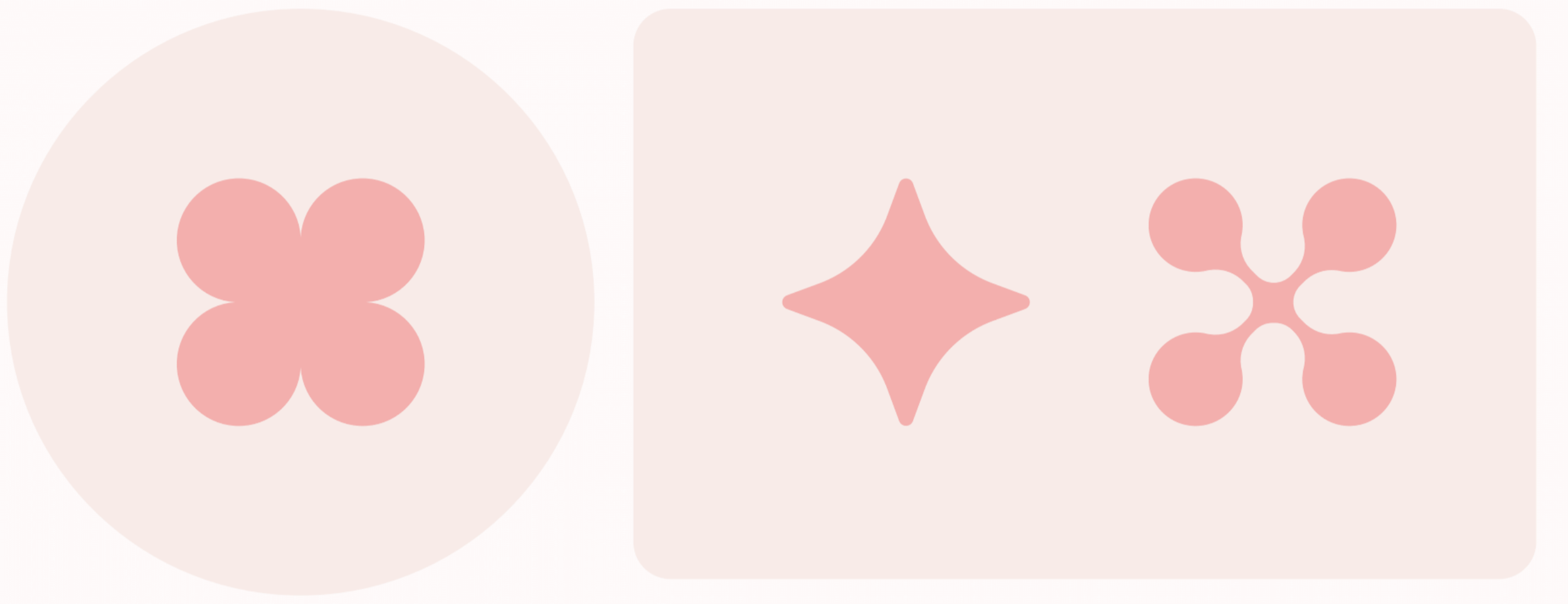
While developing the pitch deck and website for Créa, it was clear that incorporating playful and creative graphic elements would work well with the brand's messaging. Instead of a fixed set of elements, I chose versatile shapes like rounded rectangles and circles to highlight text and icons. This approach allows for flexibility while maintaining a cohesive look. The finished brand book specifies that all elements should have rounded edges to ensure a harmonious and unified appearance.
Design Deliverables
BRAND BOOK
The brand book is structured simply, categorized into the same sections seen above: colors, fonts, logo, and graphic elements. I used the brand book to simply explain the usage of the materials, for example the alignment and clear area of the logo, and use of fonts and colors. To provide clarity and inspiration, I included design examples such as business cards, website layouts, and the pitch deck. The brand book ensures consistent application of the brand’s identity across various platforms.
PITCH DECK
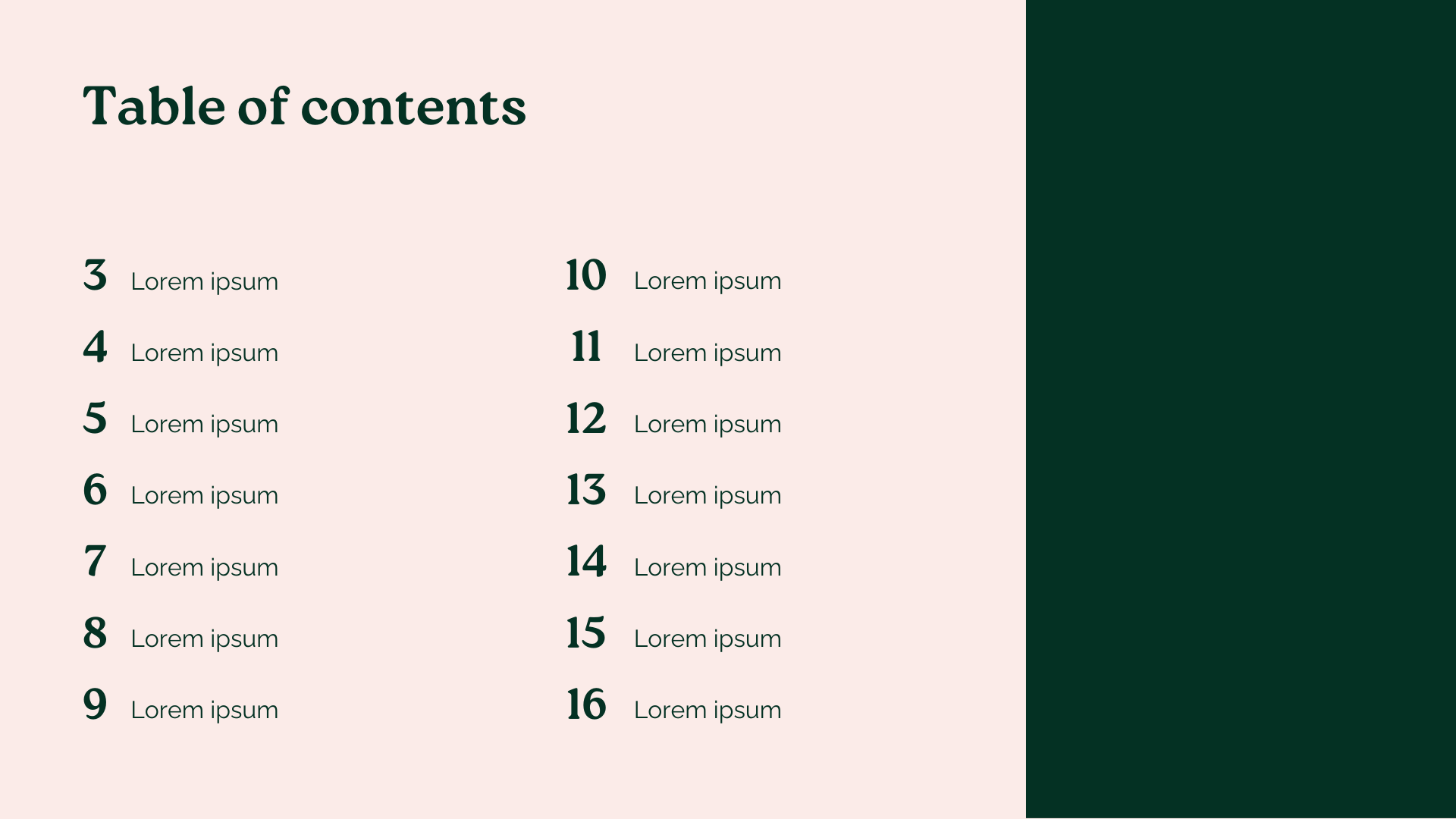
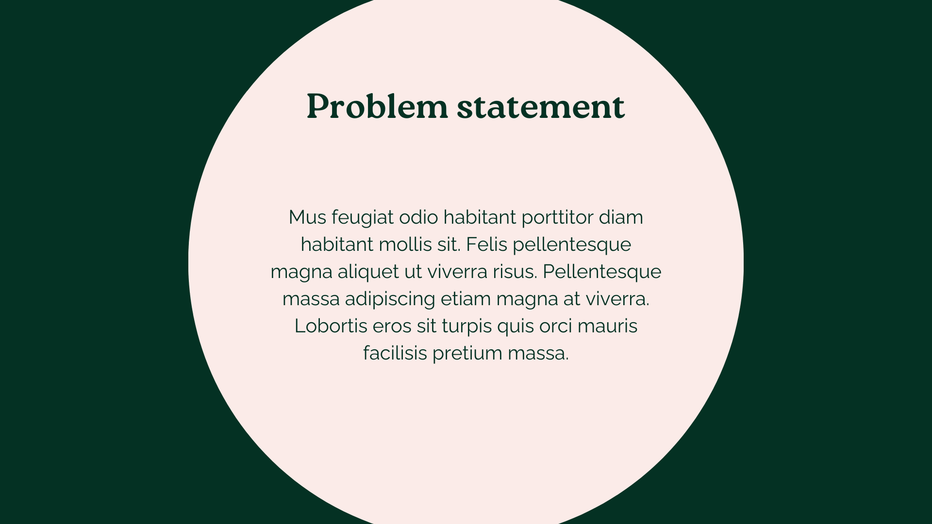
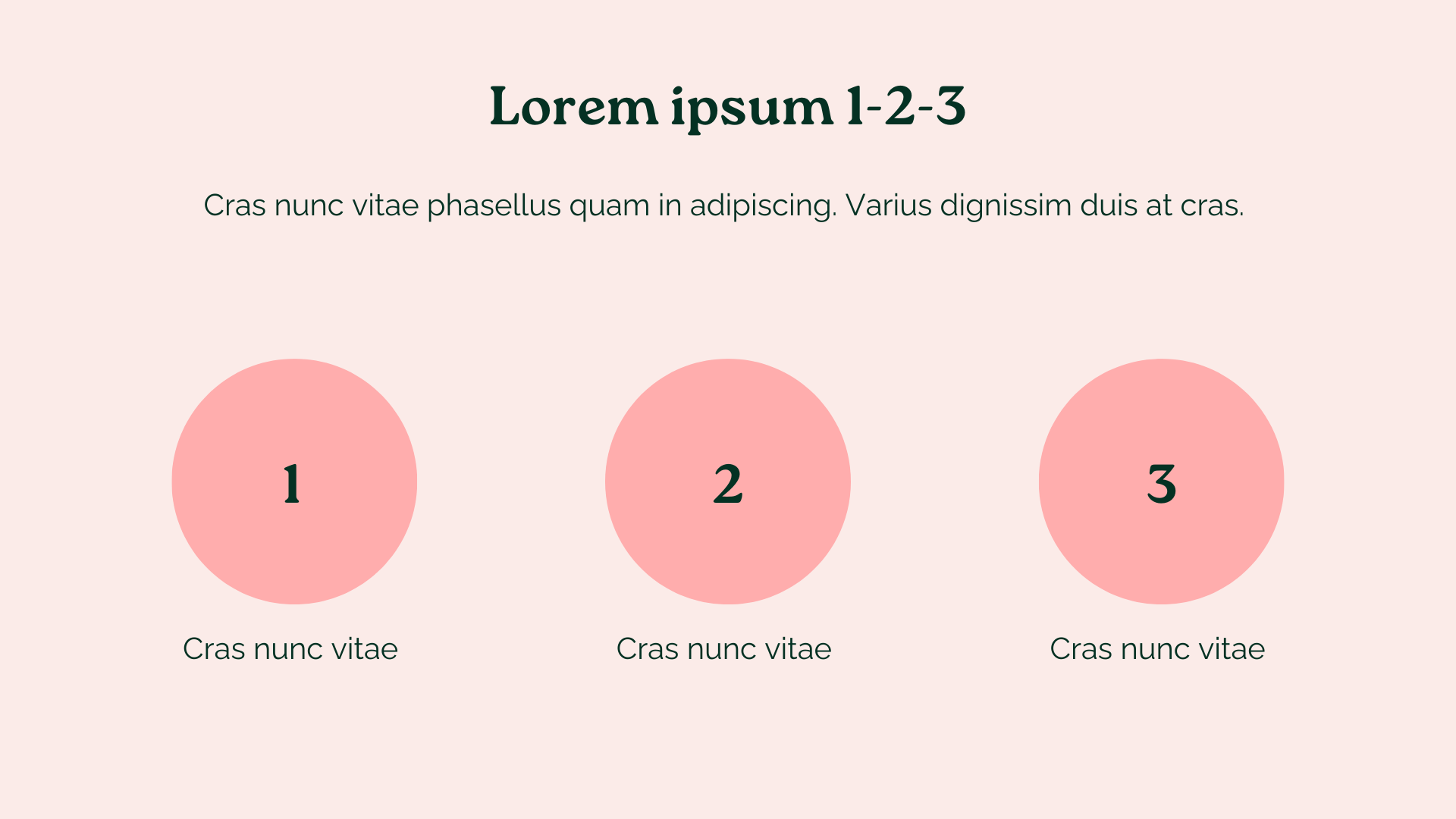
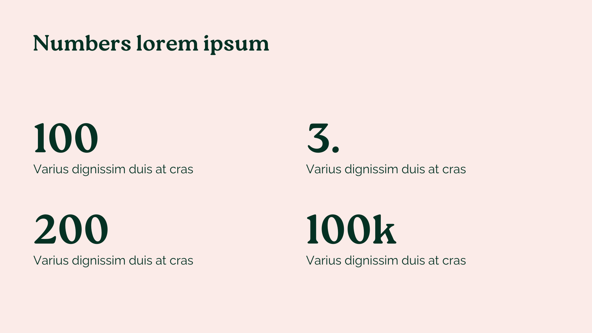
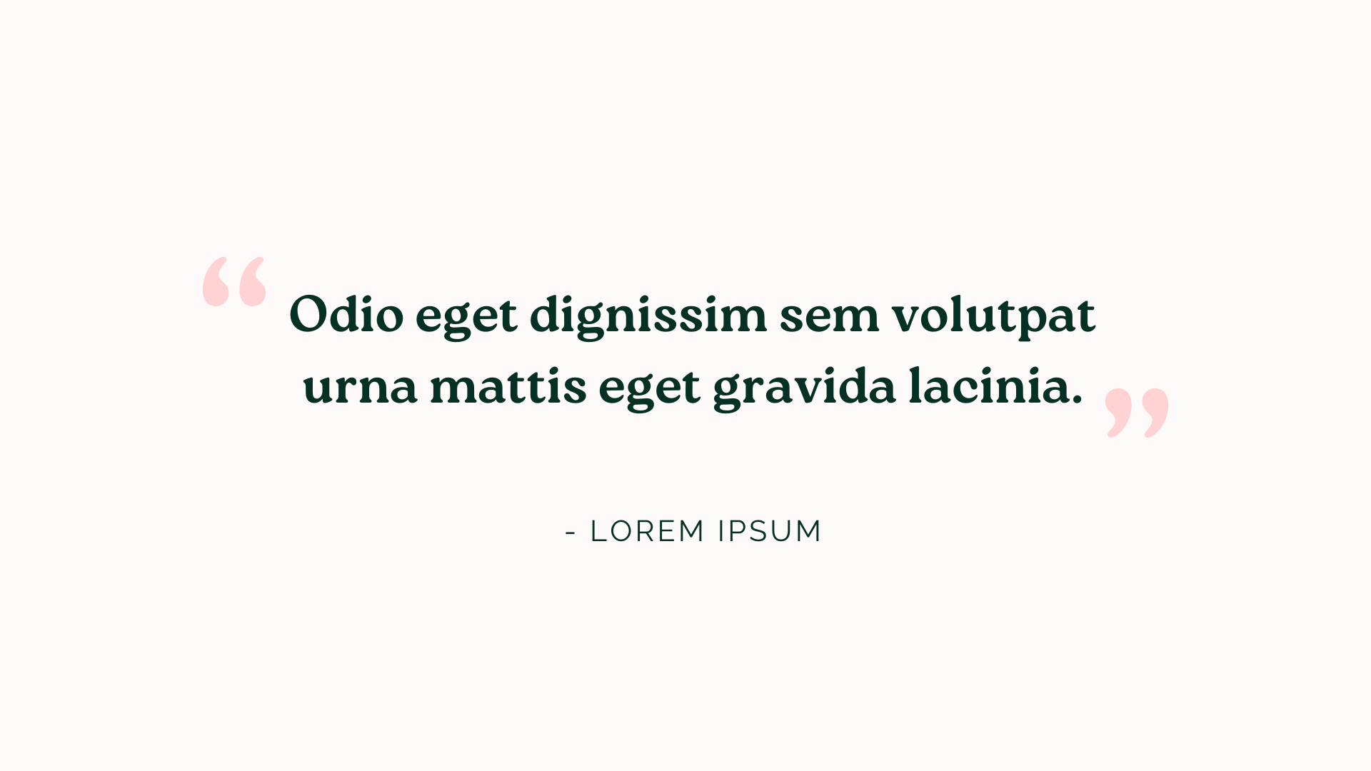
For the pitch deck, I used different shapes and transitions to draw focus and keep it engaging. The slides focus on visuals and numbers, making presentations clear and easy to follow while staying true to the brand's identity.
WEBSITE
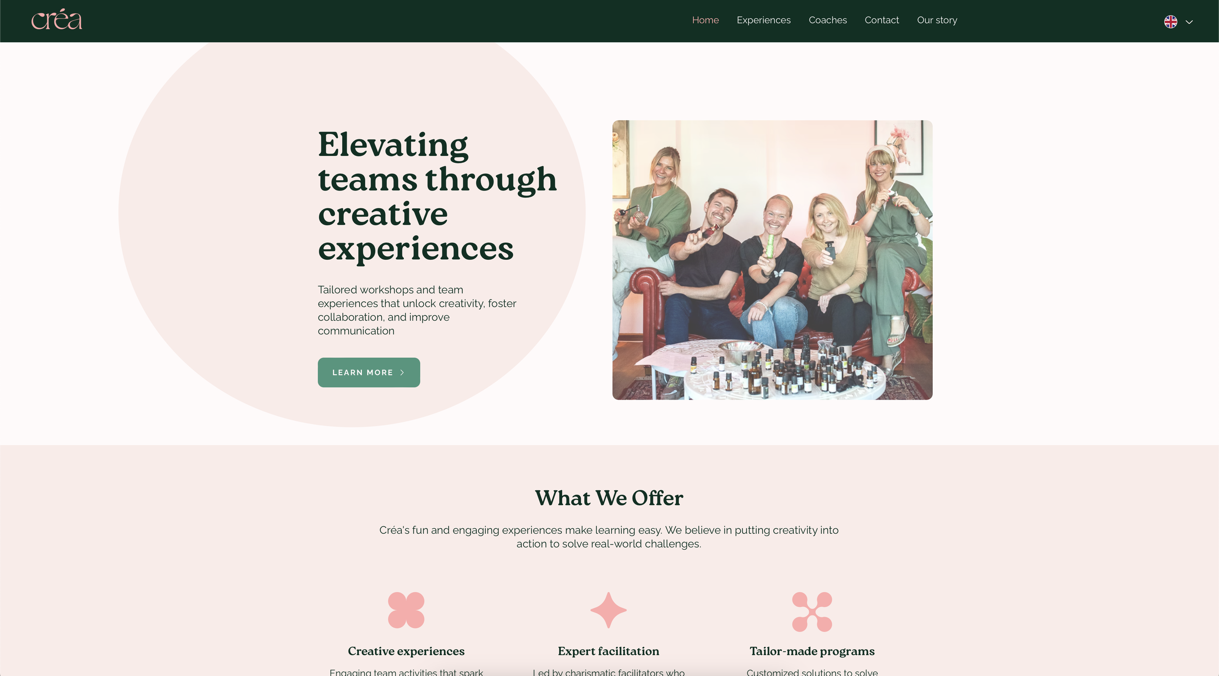
The website was the most time-intensive part of the project and it was also my first experience using Wix instead of Figma. I focused on simplicity to maintain user focus, incorporating animations and hover effects for engagement.
The homepage features smaller text sections, bullet points, and quotes to avoid large blocks of text. The other pages dive deeper into the company’s story, offered experiences, and coaches. The information architecture is straightforward, with main topics accessible via the top menu, or burger menu on mobile. The brand identity is maintained throughout the site, using main colors for large text areas and accent colors for smaller blocks, headings and graphic elements, adding visual interest. I also designed its mobile view for responsiveness, ensuring accessibility across devices.
Throughout the process, I maintained regular communication with the client, making adjustments for any content updates or new ideas.
Note: The website has since been given over to the client.
SERVICE CATALOGUE
My client needed a PDF to share with potential clients, showcasing Créa's experiences, and they requested it to be a Canva file for easy editing and translation on their part. The design is simple yet informative, focusing on presenting information harmoniously.
BUSINESS CARDS
The business cards feature Créa's logo on one side with pink on dark green for I felt it is the brand’s most eye-catching colour combination. The other side displays contact information in dark green on almost white, ensuring readability.
Reflection
This project became dear to me as it mirrored my growth as a designer. It embodies a style I love to create and see. Throughout the process, I developed my skills in structuring different tasks, managing time, and effectively communicating with my client. I leave this project not only with a proud achievement but also with an enhanced toolkit to approach future projects with an even greater confidence.
