Therasync
A health app, connecting the patient with their treatment team.
In short,
As part of my Bachelor thesis, I partnered up with a freshly founded health-tech startup to help them design, visualise and prototype their product. It’s a mix between a social media and healthcare, connecting patients with their healthcare providers and offering them a private digital space to collaborate on the patient’s treatment journey.
The subject grew close to my heart and I ended up joining their team after defending my thesis. I worked on the product for a year and a half.
During that time, I analysed a survey with over 600 respondents, conducted user interviews, created wireframes, mockups, and found a way to test the prototype in a real clinical setting.
Problem statement
A few months before Therasync began their work, the Estonian Health Insurance Fund had conducted research on the treatment journeys of depressed patients. The problem statement and also reason for founding the startup came from the research findings:
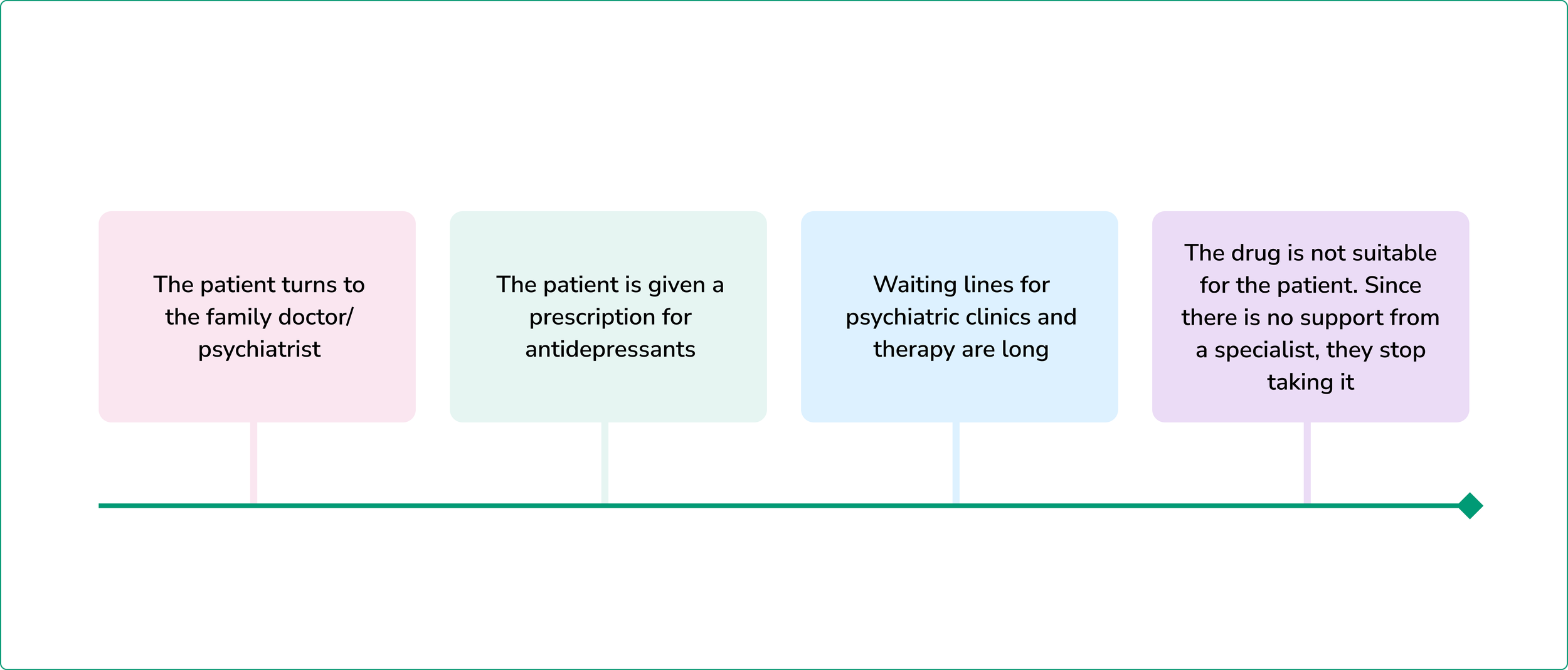
The current mental health treatment journey usually begins when a patient turns to their family physician or a psychiatrist and is more likely to then be prescribed antidepressants than to continue their treatment journey with a therapist.
Therefore their treatment might end unexpectedly after receiving a medical plan that's not suitable for them and deciding to discontinue due to a lack of support from mental health specialists.
Proposed solution
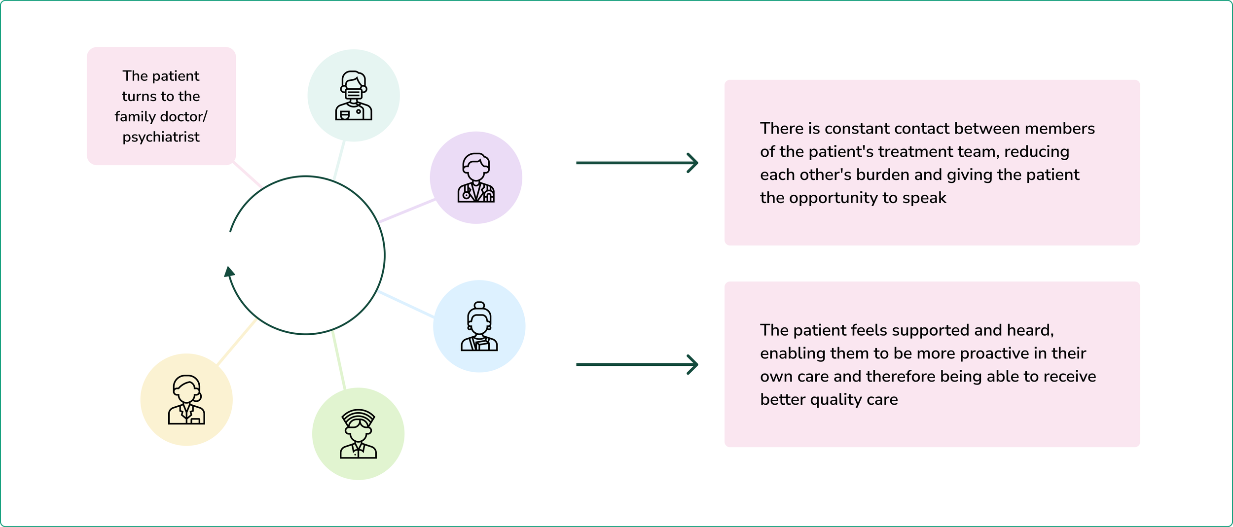
When I joined the team, Therasync’s founders had already roughly imagined what they thought the solution should look like. It would be a sort of closed social media platform for a patient and their health care providers.
Both the healthcare providers and the patients themselves would be able to actively take part of the discussion and hopefully that way, the treatment journey would be more seamless and less likely to be terminated prematurely.
It had also been decided to first focus on mental health and people receiving care for mental health issues.
Design process
My design process began with adapting to the already existing Therasync information space and learn everything there was to know about the past research, workshops and discussions. It also included getting to know the vision that Therasync’s founders had already established for their future product.
I continued with an in-depth research phase of my own and a thorough analysis for the considerable portion of data that I’d collected.
I ideated by asking “how could we…” questions that would answer to our target group’s pain points and needs, and lastly prototyped the ideas in Figma and tested it on users, repeating these two last steps where necessary.
Research
About the same time as I started working on my thesis, the Estonian Youth Mental Health Movement and Peaasi.ee had put out an online survey asking the respondents about their experience with receiving mental health care. I immediately got in contact with them and volunteered to analyse the data.
The survey had questions for both quantitative and qualitative data. Based on quantitative information, I was able to create an overview about the general picture of receiving mental health help in Estonia, and the qualitative information gave me the opportunity to analyse the personal experiences of seeking help.
In addition to the survey, I also had an opportunity to speak with several people that fit into our target group - some current and some past patients receiving relevant care.
Some questions from the survey
Have you turned to a health specialist with your mental health concerns or suspicions? (multiple choice)
Who did you turn to first for help? (multiple choice + chance to add)
What has been your experience in seeking and receiving help from a health specialist?
We have identified some possible reasons why people may delay or avoid seeking help. If there are reasons on this list that made you delay seeking help, please indicate them. (multiple choice)
Please specify your answers here. It may also be that the reason that held you back is missing from above or does not describe your experience accurately - you are welcome to open your reasons in your own words. You can also highlight which of the reasons mentioned above has had the greatest impact on you.
Have you taken your concerns to someone other than a health specialist (for example, a hypnotist, a healer or a representative of another alternative medicine)? Why did you decide to turn to them? What was your experience like?
Analysis
In total, the survey had 661 responses of which 86% were female respondents. It gave me a very thorough overview of the main problems and focus points that people cross while seeking mental health care, though I did find it lacking male input.
I created graphs for all of the quantitive questions to allow me to visually analyse the differences in age groups, between men and women, and to pinpoint any overall trends.
I’d never evaluated that much qualitative data in one go and so at first it was quite intimidating. I started by tagging all of the answers by successive repetitive keywords and bringing out any memorable quotes.
Eventually, I had a list of pain points that mental health help seeking people come across the most.
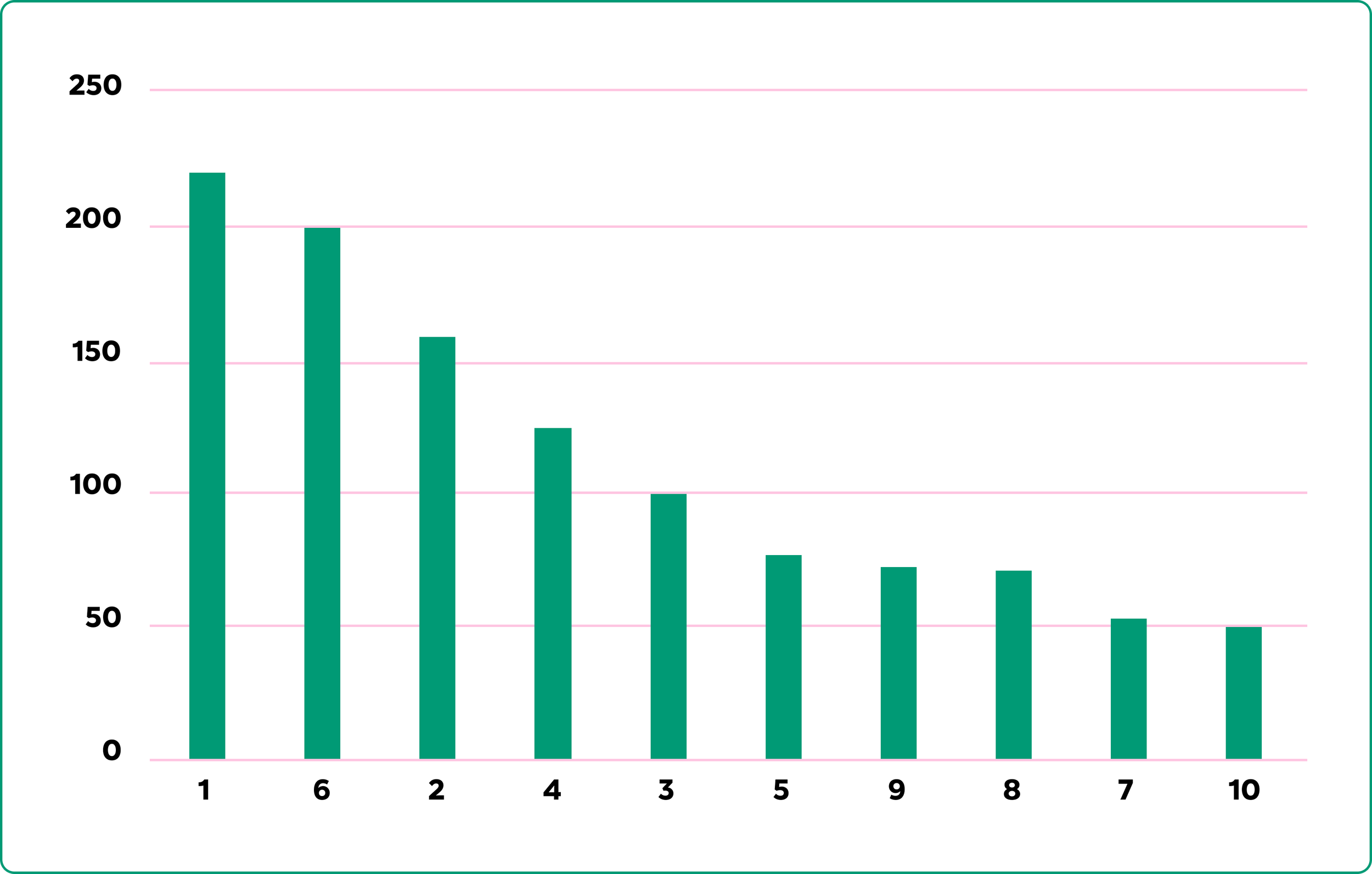
Reasons for postponing getting help
1 I felt that my concern was not serious enough
2 I didn’t know that what I was experiencing could be a mental health issue
3 I was afraid of disapproval
4 I didn't know where to start looking for help
5 I was afraid that medication was the only treatment for my issue and I didn't want that
6 Monetary reasons
7 I had heard stories of people being mistreated
8 I had heard stories about not getting enough help from mental health professionals
9 I was afraid that seeking help would have negative consequences
10 I had heard stories about not getting enough help from the family doctor
Ideation
I identified the problems which would be relevant to Therasync and ended up with three of them. I then rephrased them into questions of “how could we offer users”:
How could we offer users continuity of the treatment journey and permanent contact with specialists?
How can we offer users a perceptive and relevant approach?
How can we offer users personalised care that’s tailored just for them?
The ideation phase was not necessary to find the form of the solution, as it had already been established. I needed to integrate it with additional functions that would correspond to the previously stated "how could we offer users…?" questions.
I first created a wireframe consisting of the framework of functionalities that were in place already and then started ideating extra solutions by sketching out various different features and matching them to the existing wireframe.
Wireframes
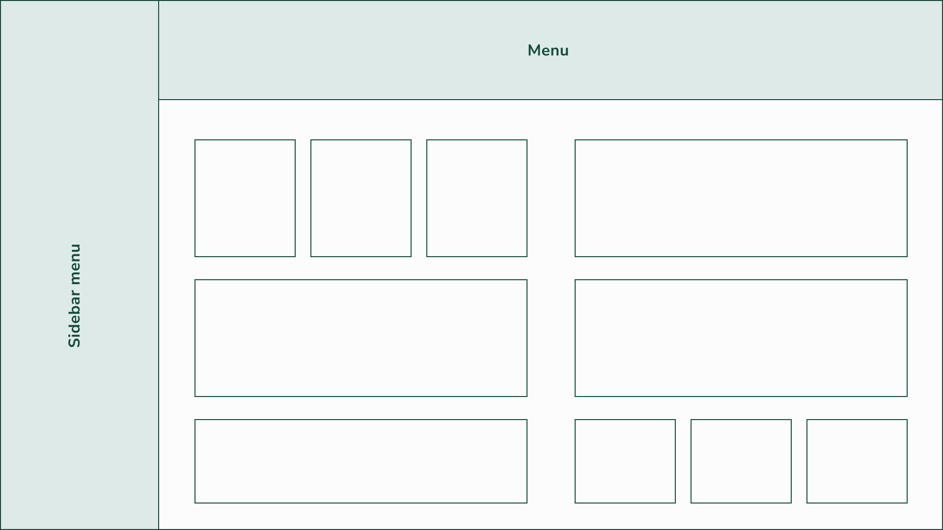
I had in mind a layout in which I wanted the homepage to be and went from there.
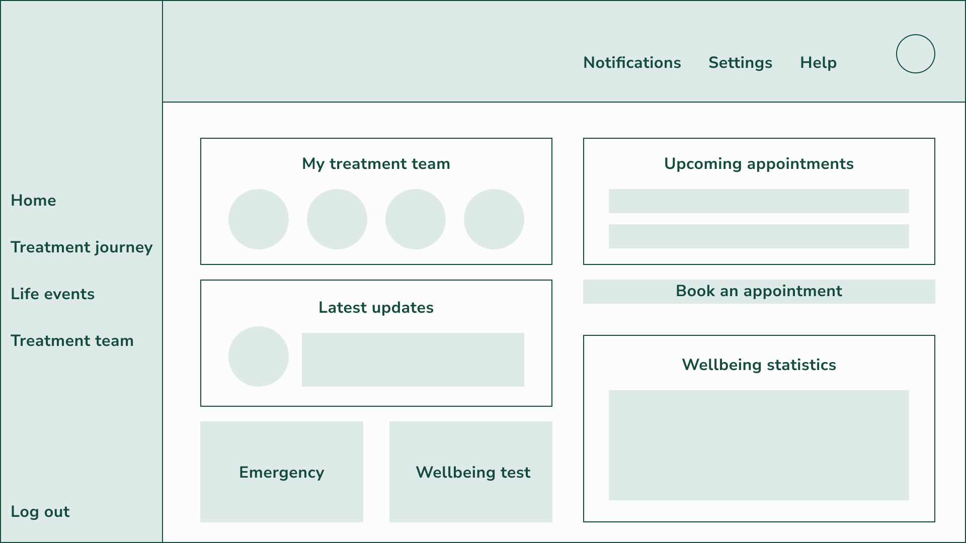
Having an overview of the treatment team, latest updates and the treatment journey feed had already been established as needed functionalities beforehand. After playing around in Figma and deciding between the functionalities I had thought of, I landed on the ones seen on the second wireframe of the homepage.
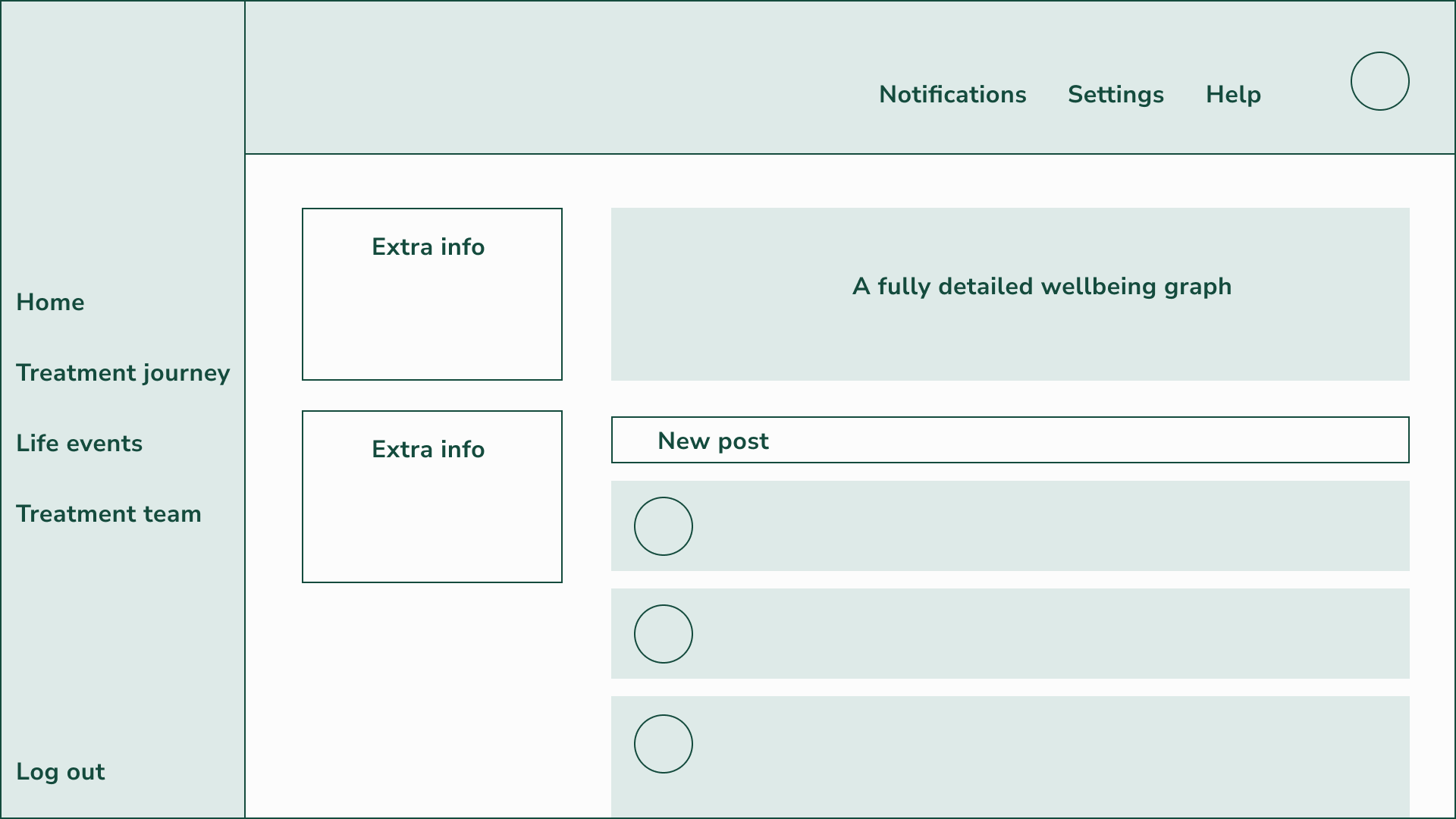
For the treatment journey page (1st wireframe) I wanted a simple social feed with all of the posts and extra information about the members of the team or the treatment on the left side. I also decided to add the wellbeing graph on this page with all of the more detailed information.
The life events page (2nd wireframe) came from my conversations with patients. A few of them mentioned that it’s often difficult to start talking about serious topics or events with new doctors and as there can be many of them you have to visit, it would be easier to just have that information ready to present to them.
Final prototype
I tend to get a better understanding of my designs while implementing the UI on them and actively playing around with the placement and colours.
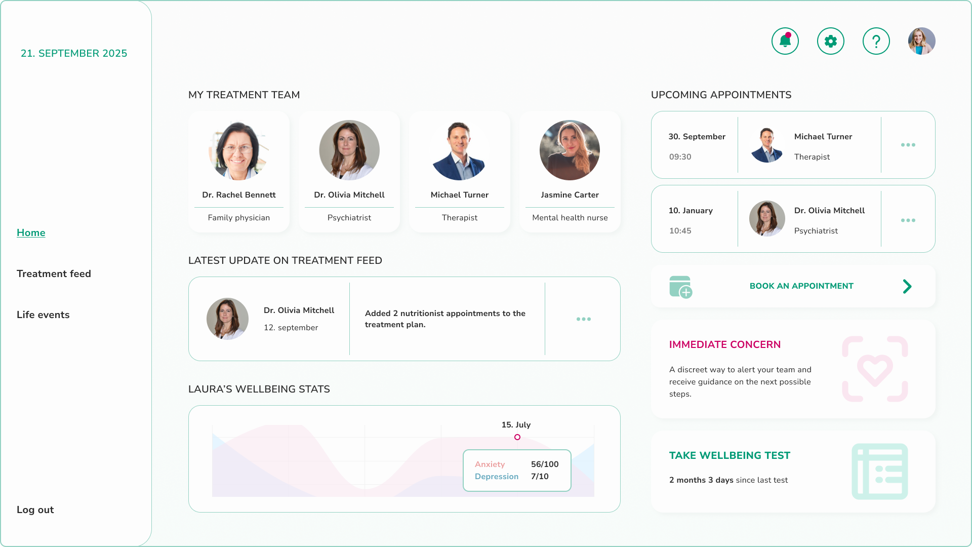
For the final prototype, I removed the “treatment team” section from the side menu as I realised it would make more sense to have all of their information on the “home” page as clickable and expandable cards.
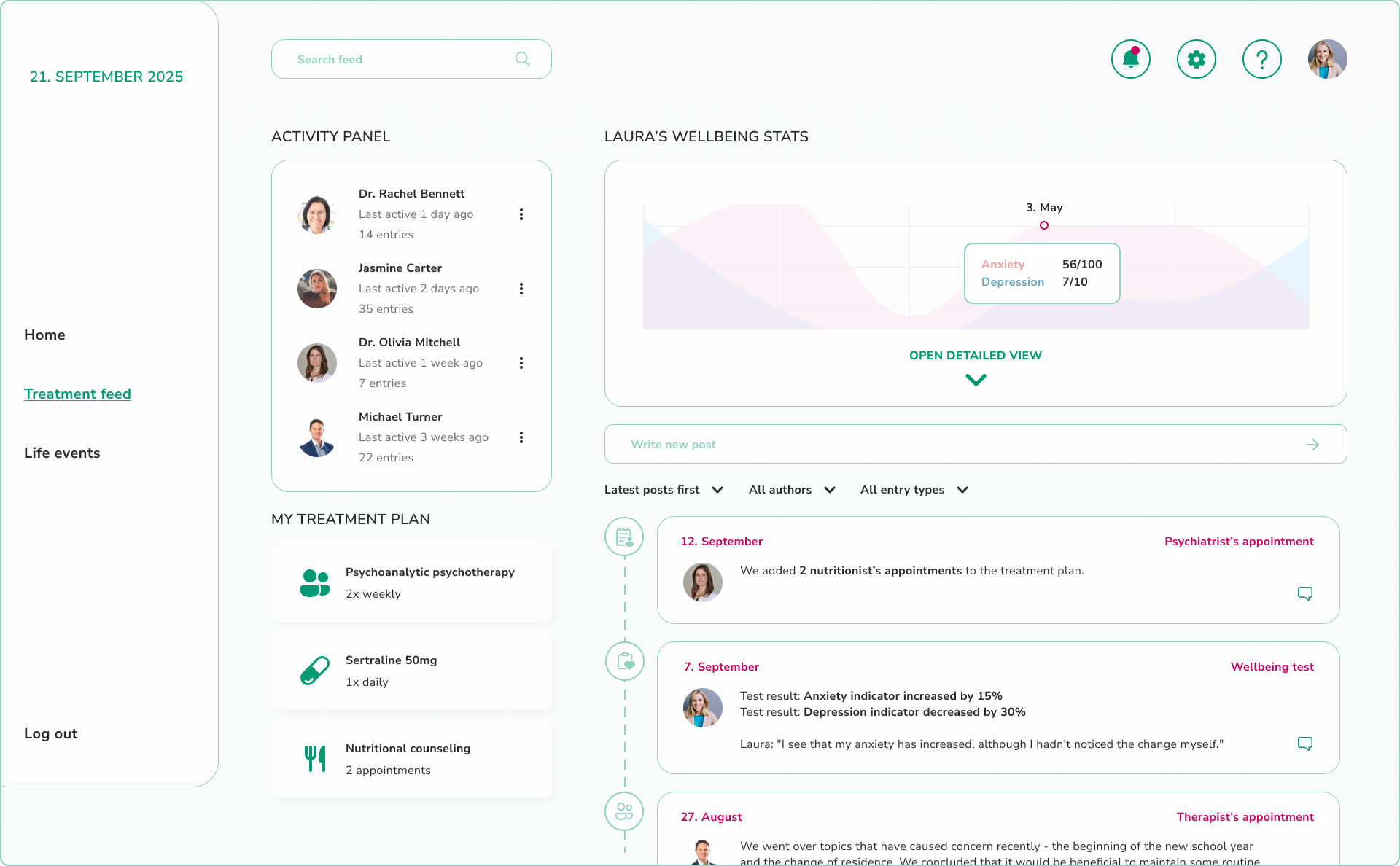
The “treatment feed” acts as a full overview of the user’s treatment so far with the posts, stats, treatment plan and an activity panel.
The “life events” view is simple and customisable by the user. The user can also change their team members’ rights and choose who can see which information.
Feedback from user tests
I tested the prototype with a total of 6 people who were currently or had previously encountered seeking and receiving mental health help.
The "emergency" button on the main page received the most comments. Although it was mentioned that it could be a very useful tool, there were questions about where exactly it leads or how certain it is that the patient will get the necessary help by pressing the button. It was also pointed out that for a depressed person, mentioning an "immediate concern" and being "prepared" for it can be uncomfortable.
A lot of positive feedback was given to the possibility of doing a wellbeing test - it was mentioned that it would be useful both for the treatment team and for the patients themselves, as it helps to map their own treatment and notice the changes that have taken place.
In the treatment journey view, it was pointed out that it would be beneficial for both the patient and the rest of the team if the patient would signal through entries when completing the treatment plan or doing daily tasks. It would give the treatment team a certificate that the patient is also actively engaged in their own treatment, and for the patient it would be a motivator and a reminder to continue the treatment.
A common topic during the tests was interest in self-help - five out of six testers pointed out the need for patients’ own personal tools.
A couple of testers suggested that the patient could have a view where they could record their daily activities related to the treatment - for example, when they take medicine, move or write in a diary. Such solution would be helpful to the patients themselves, as it helps to get an overview of their own activities and how they affect well-being.
Concept testing in a clinical setting
Our user testing and feedback collection confirmed that patients would find this tool beneficial and be willing to adopt it. However, we soon discovered that the more challenging aspect would be convincing healthcare professionals to accept the concept.
Many of our team members were either recent medical school graduates or in the final stages of their medical education. As a result, we had extensive firsthand knowledge of the poor quality of the software programs healthcare workers are required to use daily, as well as the intense time pressures they face in their schedules.
Our challenge was to demonstrate that Therasync would save time for healthcare professionals, rather than consume it.
To do that, we used simulation techniques. Our team developed five distinct patient profiles and conducted mock doctor's appointments with an unbiased doctor in a controlled environment. We recorded and transcribed these sessions, measuring the time spent in consultation. We then compared these results with appointments that didn't utilize Therasync's available information.
To our relief, we did see a positive outcome in analysis and confirmed that the appointments that used Therasync’s information, did save time.
Despite the proven time-saving benefits, there was still a drawback that we couldn’t ignore. The integration of Therasync introduced an additional step in the doctors' workflow, requiring them to interact with another platform during their already busy workday. This aspect presented a less-than-ideal scenario.
A more recent app adaptation
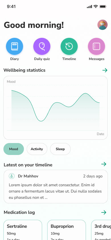
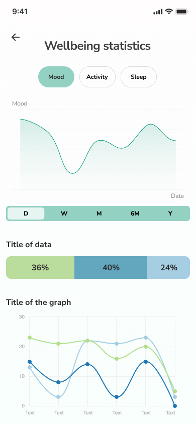
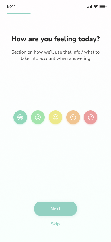
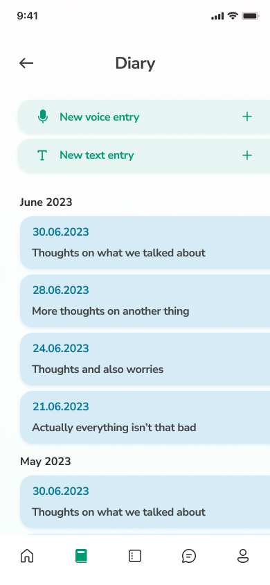
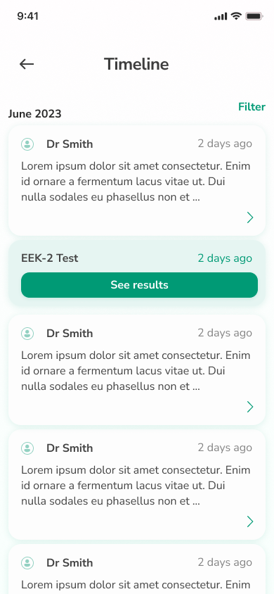
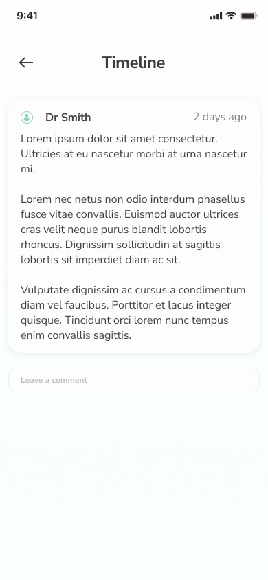
Before the Therasync development was put on a pause, I was working on a patient-side app adaptation that would have its focus on self-help tools. I based it on the research I’d done during my thesis, different testings we had done since and also the knowledge of doctors dealing with mental health patients and what they’d need to know most.
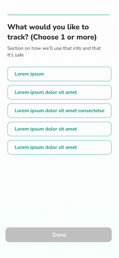
The idea would’ve been an app where the patient tracks their own wellbeing, with the possibility to easily share the data with their healthcare specialists as needed.
All of the frames were still in process when the work was put on a pause and therefore aren’t fully finished, balanced and coordinated. I had a lot of fun with them, imagining different ways to show a function or visuals to make recording data a bit more lively and enjoyable. Even though this specific app won’t be developed, I’m very glad I got to work on it.

